

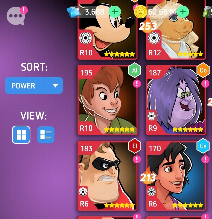

Red skill icon allows us to know if the character has acquired red skill or not. It is great.
But the icon has some problems.
-
Promoted from R9 to R10, the letters become longer and the red skill icon size grow bigger. It gets even bigger if it’s in a language other than English. So, the portrait is overly covered.
-
The red skill icon is separated from the letters below. It’s very unnatural.

So I thought about solutions.
 First choice
In Settings, it would be nice if we could decide whether to show or hide the Red skill icon. On/Off way. If I hide the red skill icon, I can’t see my character’s red skill icon, nor the enemies’ red skill icon. I like to see the portrait than to see the red skill icon.
Second choice
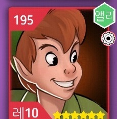
The current red skill icon is dependent on the letters below. The red skill icon size get bigger as the letters below get longer.
So it would be great to put the red skill icon independent of the letters below. In other words, it separates the red skill icon from the letters below (R10, R9…).
like this. ↓ ↓ ↓
@Polaris I think these methods will reduce the inconvenience of viewing the portraits of the characters.
If there’s a better way than this, Anyone let me know!
Thanks