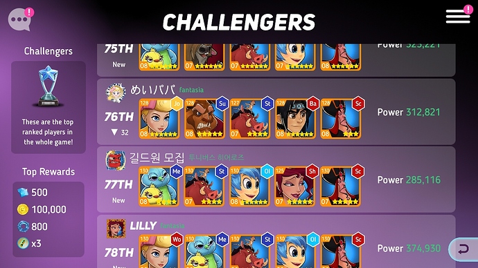
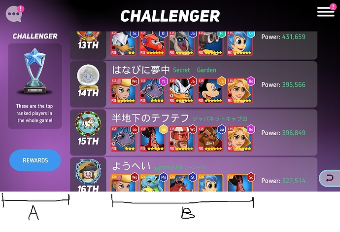
Arena league design is a little changed.
Profile picture gotten bigger is great!
But 5 heroes portraits are smaller than previous portraits.

-previous-
.
.

-now-
How about reducing ‘A’ length and
How about lengthening ‘B’ length?
Bigger portraits makes eyes comfortable!
And then we can see portraits in more detail!
