Avatar Menu Too Long

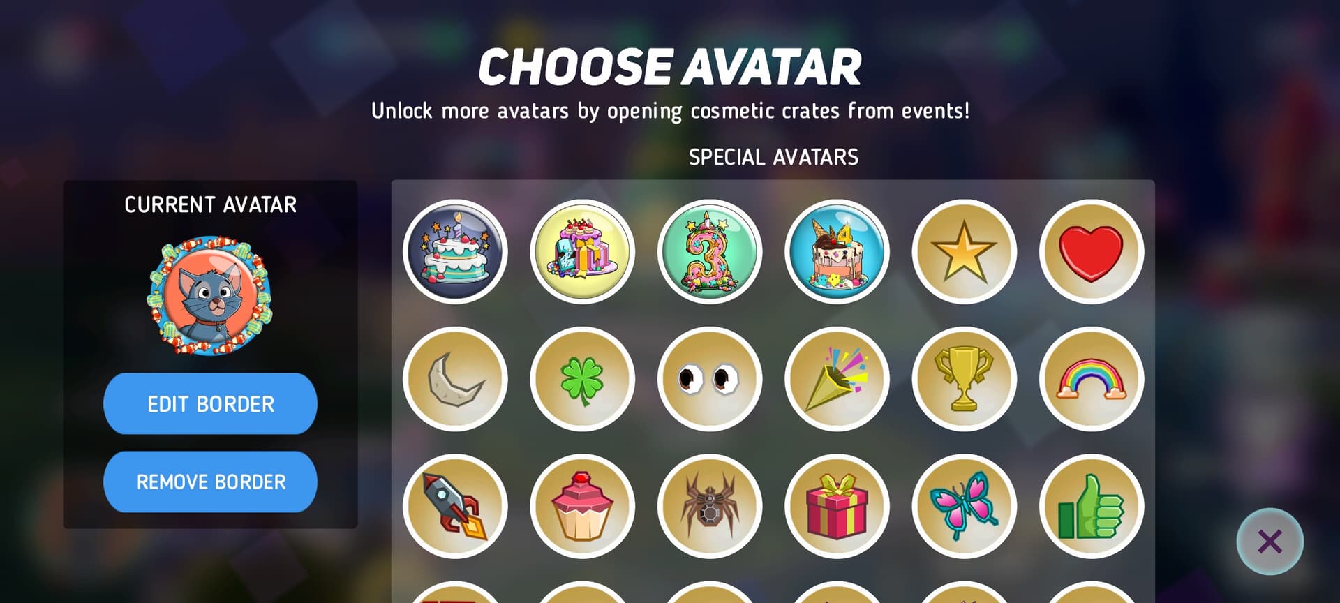
As the title says, this menu is too long. There are so many badges that you’re just scrolling forever to reach the latest avatars, and it can take a long time to find a specific one you might be searching for.

I propose shrinking the table and introducing filters to the right - quick example -

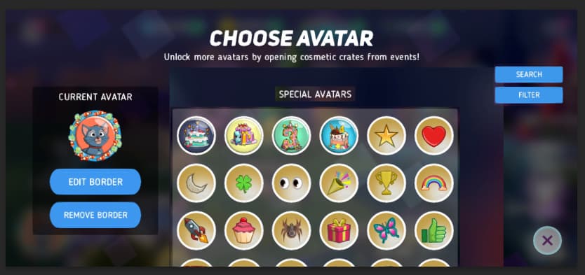
Then we can choose to search for avatars by name directly, or we can open the Filter menu - which will look similar to the Hero Filter menu - to toggle on/off each category of Avatar

@Loutre !

10 Likes

Would be highly appreciated change.

I don’t change my badge all that often anymore, but when I do it is not an easy process anymore

Filter certainly would be great, but even a fix to make sure you have smaller icons and less scrolling would be nice

2 Likes

Filter would be a great idea!

I don’t mind the scrolling as much, but it’s starting to lag a bit which is annoying

4 Likes

This idea is largely unnecessary. It’s like asking for a change that nobody else wants. Like rambling on about a topic of no interest, this is not a good suggestion.

I’m struggling to understand why you would resurrect a topic from four months ago just to say it’s unnecessary and that “nobody else wants” it (even though 10 people now have liked the original post), and then edit your comment twice during the day to ensure this post, about a change you believe is “of no interest”, remains near the top of the active topics.

3 Likes

Umm, yeah 4 months and out of nowhere :rofl:
But now that this thread is kind of back, ‘yes’ filter those avatars please!

PerBlue Entertainment | Terms of Use | Cookie Policy | © Disney