Hi @Samm and team!
With the double cap raises happening, players are forced to spend more time in DH than they are comfortable with / used to. This leads to frustration and a feel of the game being a “chore”.
To avoid that, we need to look into how to make some actions easier to complete so that they take less “clicks” / time. This is applicable even outside of double cap raises but it is currently an issue.
Here is the to-do list for every cap raise:
- Level heroes - easy to do
- Level skills - easy to do, thanks to that “Max” button
- Rank up heroes
3.1) Craft easy badges - easy to do
3.2) Open badge crates - tedious - Get Hero Chips for Red skills - tedious
- Get Skill Chips for Red skills - tedious
- Level Disks - tedious (once)
Here are some simple (I hope) suggestions on how to make these easier by reusing existing interfaces. Excuse my on-the-fly paint skills.
— Suggestion 1: Get Hero Chips for Red skills ----
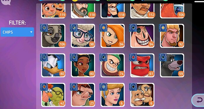
Currently you have to cycle through your 200 Hero roster to see which heroes don’t have enough Hero Chips. And you need to do that 20+ times per cap raise. Some people have suggested sorting by Red skill level, but that won’t solve the issue as you might be working on some red skills that are not maxed yet.
Instead, my suggestion is to update the inventory window for Hero Chips:
It is already sorted by count, and when you open it you can easily navigate left and right. Unfortunately the window looks like this:
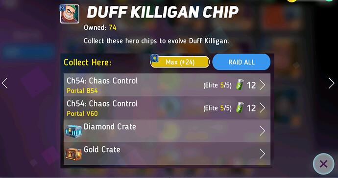
Instead of showing this useful message, it can actually allow us to get the chips right here and right now, by adding the same interface we already have for hero chips:
— Suggestion 2: Get Skill Chips for Red skills ----
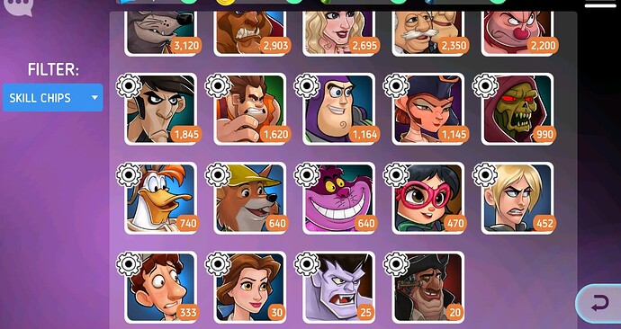
For the heroes that are not at max red skill it is similar to farming Hero Chips, you go through the 200 heroes multiple times. For those that are at max skill however, it is very tedious. You have to open the inventory window, see which skill chips you are missing, potentially write them down on paper, then go to the Hero screen and find them 1 by 1 (or add them to City Watch).
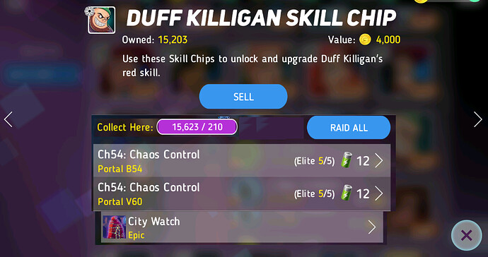
Instead, my suggestion is the same as for the Hero Chips, do it directly through the inventory window:
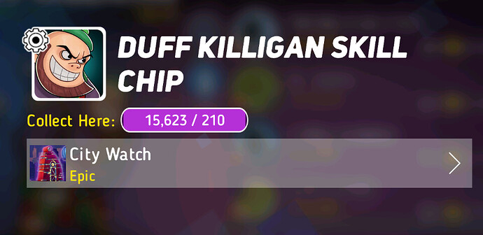
For this however, the interface for “Get skill chips” needs to be updated. They now drop from elite campaign and that was never reflected.
So the end result should look something like this:
— Suggestion 3: Level Disks ----
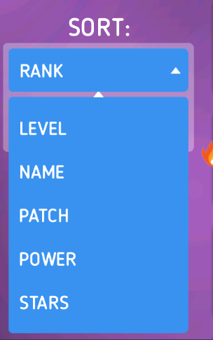
Currently you have to go through all your 200 heroes and see which ones have a max level disk, and if they do, decide whether to increase it after the cap raise. This is only done once so its not a big issue. Still, a simple option to sort heroes by “Disk Level” would make this very easy:
— Suggestion 4: Open badge crates ----
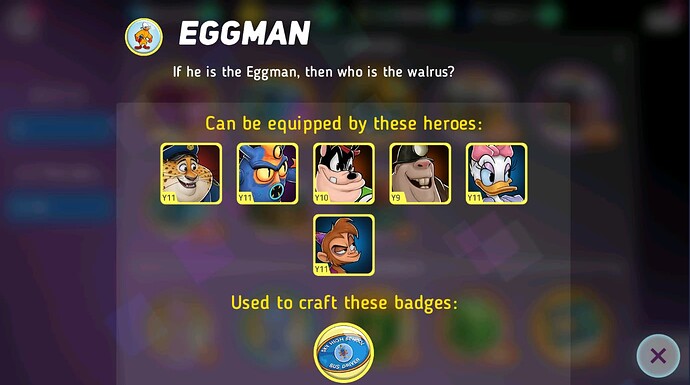
Badge crates have become a core mechanic for keeping hero ranks updated after cap raise. Currently, after you open a badge crate and see the badge you got, you have to go equip it. For that you need to press the “i” button and see which heroes can equip it, then remember those (or write them down), go to the hero screen, check them and decide which one should get it. This cycle repeats over and over again and you have to go through so many screens for each badge. It is very tedious and it is the reason I have 300+ unopened crates - I just physically don’t have time to open them and upgrade my heroes.
Instead, my suggestion is to be able to equip badges directly from the badge info window:
If these heroes are made clickable, one would be able to equip the badge right from here.
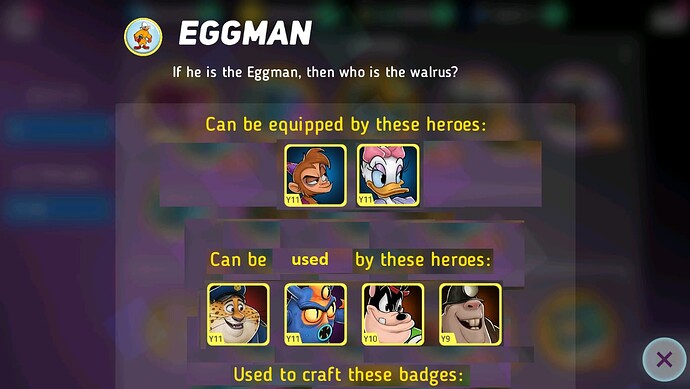
Another issue with this window is that you don’t know which of the heroes can equip the badge right away. This makes it harder to decide who to give it to. It would really help if the heroes are split into 2 groups: Heroes that can equip it right away, and heroes that can equip it in a future rank.
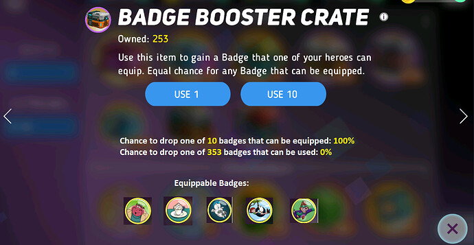
Finally, since badge crates are so important for cap raises for both F2P and P2W players, they should be made easier to use by everyone. I have been trying to teach people how to use badge crates optimally for over an year and the part that is hardest for people to understand is how to know if they have enough slots open. My suggestion here is to just give this information on the badge crate screen. This will only save time for the people that know how to use them (no power gain for them) but will allow more people to use them efficiently, making them less likely to quit due to falling behind.
You can add it as text:
Chance to drop one of 10 badges that can be equipped: 100%
Chance to drop one of 353 badges that can be used: 0%
Additionally, the badges that can be equipped can be shown as a clickable list in case we want to craft some of them and reduce the number.
With those 2 features combined, one would be able to use his badge crates without ever leaving the badge crate window by opening the crates, equipping the badges (+ upgrading the hero) and crafting any badges that he doesn’t wish to drop from future crates.
As final words I want to say that these are just suggestions and there could be better ways to improve these annoying / time consuming activities. I really hope the team can look into the QoL of the above areas. Hopefully some of the suggestions are simple to implement.

