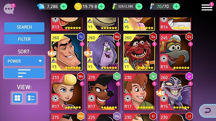
Gonzo’s battle badge icon(or red skill icon) size is bigger than Animal’s.
Because the letter “R19” is longer than the letter “Y1”
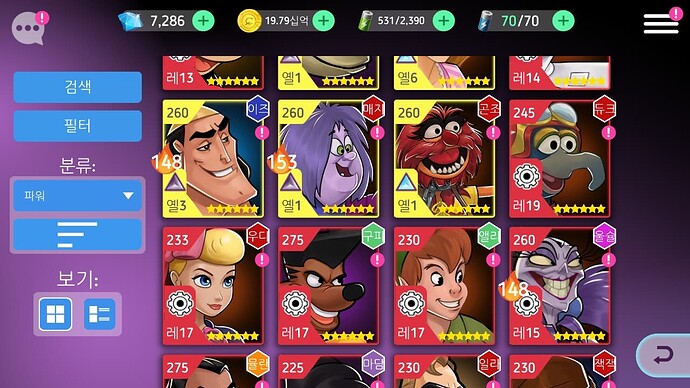
And this is Korean screen. Gonzo’s battle badge icon(or red skill icon) size is bigger than Animal’s.
But in Korean screen, red skill icon is bigger than in English screen.
Because the letter “레19” is bigger than the letter “R19”
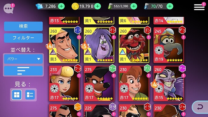
In Japanese screen, the same is true in Japan.
On non-English game screens such as Korean or Japanese, the text is larger, covering more of the portrait. Not only Korean and Japanese, but other languages as well.
If the Korean or Japanese “font size in hero portrait” is reduced, I think this problem will be improved. I think the battle badge icon size of Animal (Y1) on the “English” screen is the most appropriate size.
I like character designs or portraits for Disney Heroes.
I think it is unnatural that many parts of the portrait are covered by icon. Please think about this issue.
Thanks


