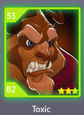
Toxic!!! Thank you to everyone who voted.


Hurray, the best option won! 
Hooray!! I voted for toxic!
Awesome I’m glad one of my other favorites won
Let’s go I voted for toxic.
See what you all did there 
And this is why UI Design should be left to UI Designers, not random (mostly children) on the internet.
Apparently I must edit the most liked comment on the thread, since it was hidden for supposedly being Inappropriate 
The chosen design is amazing!! It fits really well with the rest of the game aesthetic 

In a game where the design & visuals are by far it’s strongest asset and something the team is clearly very good at (seriously), it’s certainly… interesting, to open up such decisions to the playerbase.
yay! we have another green one, except this time, it’s in neon 

rainbow or black should have been an option tbh.
i agree that this was not the best way… most of these people are posting for the first time and probably have no idea what the impact of this is
We already can’t distinguish between a lot of things ingame, another green will just make it worse
But, on the brightside, highly probably that it will all be scrapped before this is implemented 
Hopefully the shiny Toxic green won’t be too strenuous on my eyes as a light sensitive person.
While probably not pain, that shininess will likely irritate my eyes unfortunately.
Hopefully there can be a settings toggle to make the color less bright for those who are light sensitive.
.
Hopefully Toxic rank as a Rank won’t encourage more actual social toxicity.
Not sure if PerBlue will take any of the fan suggestions into consideration, but yeah a second poll with the fan suggested Rank colors and the 3 top ones from this poll won’t be a bad idea if making it a poll.
Then again I see the chat above and I agree that another green isn’t ideal even if shiny.
Would have preferred if the UI Designers taking the decision as well, even if fun to vote.
Hopefully we get another Hero Refresh Vote soon, but yeah we will see.
I also like green  , just think Spirit is more suitable.
tbh, If this post not exist, Toxic’s vote decreased by 3% — 6%  So many love :v
“My character is toxic rank” does not sound natural at all.
And probably also voted it because "yooo leng name innit! TOXIC fam 
 " without considering the actual appearance, despite the names not actually even being finalised
So far it’s clearly opposite, people which choosed platinum are toxic 
which is it?
What does that even mean when you said “tanks of toxic
I hope you reduce the light spreading a little…
If the spread is excessive, the character’s portrait may look blurry.
probably tanks = ranks, as how many ranks of toxic it will be.
Like Red had 20 ranks.
Misspelling. Just edited it to ranks
About 2 months left, currently being Yellow+26.