
Yeah, I don’t know what the right word for it is, but I do kind of agree.
Yeah, at the very least not an ideal or in-character expression for Ian.
Hopefully PerBlue can fix his expression later.
1 Like
I also think Honey lemon looks off, same with Ian
I’m okay with Honey’s looks, it’s her animations that look too rushed.
To be honest, this is my favourite out of all new Elsa’s animations. Her intro is okay, and I really dislike the defeat, the old one suited her much better.
2 Likes
Precisely 3 characters bother me immensely: Belle, Calhoun, and Alice.
For precisely the same reason: Their faces are all 100% uncanny and wrong.
(Also Kim Possible bothers me the most because she just indisputably looks out-of-place in the game. Stand her next to Violet, Jasmine, and Mulan–fellow human girls around her age–and she looks like an alien.)
Her’s looks accurate, though- Oh I see what you mean now
Kim is from a Disney show, not a movie, so of course her animation style looks different 
Next time, compare characters to themselves in their movie/show
I think PerBlue used specific screenshots for designing. Gsston as an example. His skin looks way darker than in the movie, but during the “Gaston” song and…well, all scenes in that building, it looks just like in the game.
7 Likes
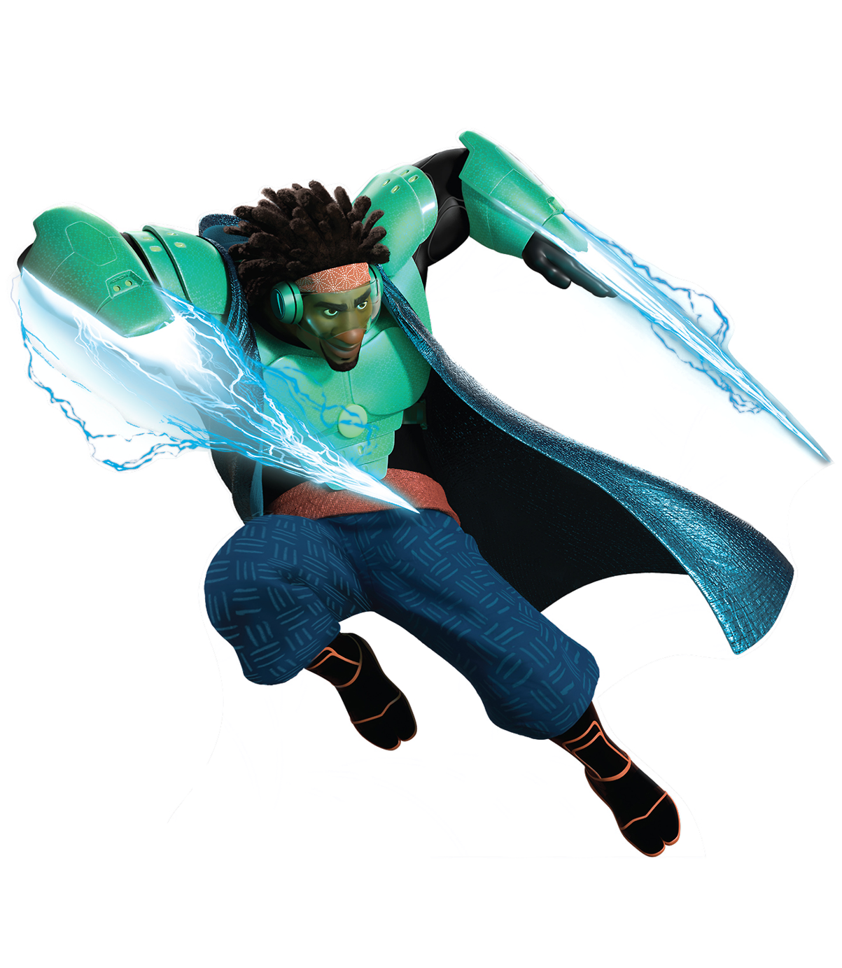
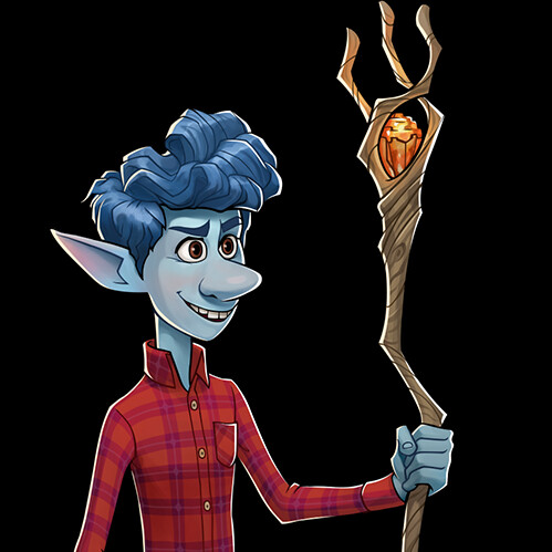
I think a lot of characters look off but it mostly comes with the Onward characters. Ian’s face makes it look like he’s a villain and not the Ian we know, Barley, just one look at his face can tell you, and Manticore looks way too serious. It also comes to me with the Big Hero 6 characters, but that’s with their design. Wasabi’s missing what’s either a cape or a sweater, Honey Lemon’s animations make her seem more like a robot than a human, Hiro is the only out of his super suit, (which makes no sense if all the others do) and Baymax is the only one who I don’t have problems with.
1 Like
Wait, Wasabi’s armor never had a cape in the movie, did it?
Well tbf, him wearing his suit wouldn’t make the most sense for his skillset, either, given how he never has/uses his bots while in that suit.
3 Likes
No, but strangely the merch and promo images had him wearing one.
And yeah, Hiro never uses the microbots in suit, but he did in Disney Infinity. Also non canon.
1 Like
Frozen 2 Elsa. Her outfit is boring and way less iconic than her ice dress. Also, her poses were more graceful. I wish she could go back to her previous appeareance
I like both Elsa’s current and previous outfits. But I like current Elsa’s face better. There were subtle changes to her face.
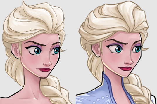
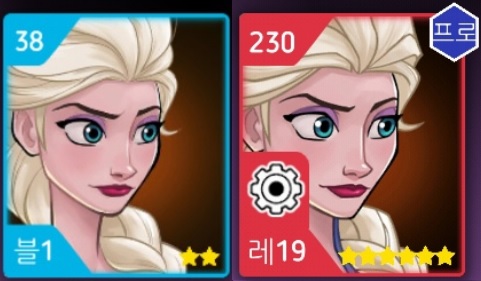
And the face in the portrait is enlarged so it looks great
(It would be more perfect if there were no ‘Red skill icon’ that occupied more places than necessary)
Same ! This is actually the only reason why I started playing this game in the first place, and I care much more about my affect towards theses characters than strategy. I am really satisfied with the designs in general and we can tell the art team improved itself over time. It’s just pure joy to discover the final design in the patch notes, and the motion animations after the update 
If i had to make some comments, it would be on these heroes :
-
Elastigirl, Dash and Violet : They don’t really look like their movie counterparts to me. I mean, I don’t know how to explain it but we can see that they are one of the oldest characters in the game and the design process was different. I would love to see a visual refresh for them but I don’t think it’s possible…
-
Vanellope : I agree that she would look better without her goggles, even though she wears them in the movie
-
Ralph : He’s clearly not the Ralph from the movie. At the beginning it looks like PerBlue went with the idea of ‘transforming’ the heroes a little bit along with their arrival in the City so they would look more suitable for fighting, But I feel like they slowly gave up this idea to stick more faithfully with the original designs.
-
Hiro Hamada : my biggest disappointment !! I’m so frustrated he’s not in his supersuit, he would have looked so much cooler and it would have been more consistent with the rest of the team. I’m not a fan of his design especially with the neurotransmettor controller around his head
-
Evil Queen : My 2nd biggest disappointment. The transformation is a good idea and effect animations are well done by PB but I wish her hag form was not her main design and only part of a skill
-
Calhoun, Aladdin, Ian and Fairy Godmother : their faces look a little off to me but I can’t really explain why… But nothing that bothers me that much
I know Belle’s appearance is debated a lot but I personally love this square-ish style
Hercules looks perfect to me, and very faithful to his original look. It’s normal we don’t see much of his left eye, because he has the typical greek profile, with the forehead and the nose making a perfect straight line
wow I didn’t know they slightly changed her face and hairstyle ! thank you for the comparative pic 
As it is my favorite hero, I love both of her versions but I prefer the current one. Sadly it came with the only thing I hate in this game : her defeat animation. It’s so off-character !! I can’t believe they went with this idea and validated it ! Her victory animation is beautiful though
1 Like
I actually made a quick edit on Ian, and I got to say just editing away the line beside Ian’s eye help’s Ian aura a lot, even if not feeling 100% in-character I think at least with his edit it is an expression he could have had at times more so.

Does at least look better than this:
While I still think Ian’s smile still look weird and eyes and eye brows expression together, it isn’t as easy of an edit so not sure if I have the skills for such an edit. Will maybe try later, but at least this helps in my view :-).
1 Like
Me too!
1 Like
3 Likes
Yikes, Pocahontas looks…let’s be diplomatic and say “rough.” Big oof.
2 Likes